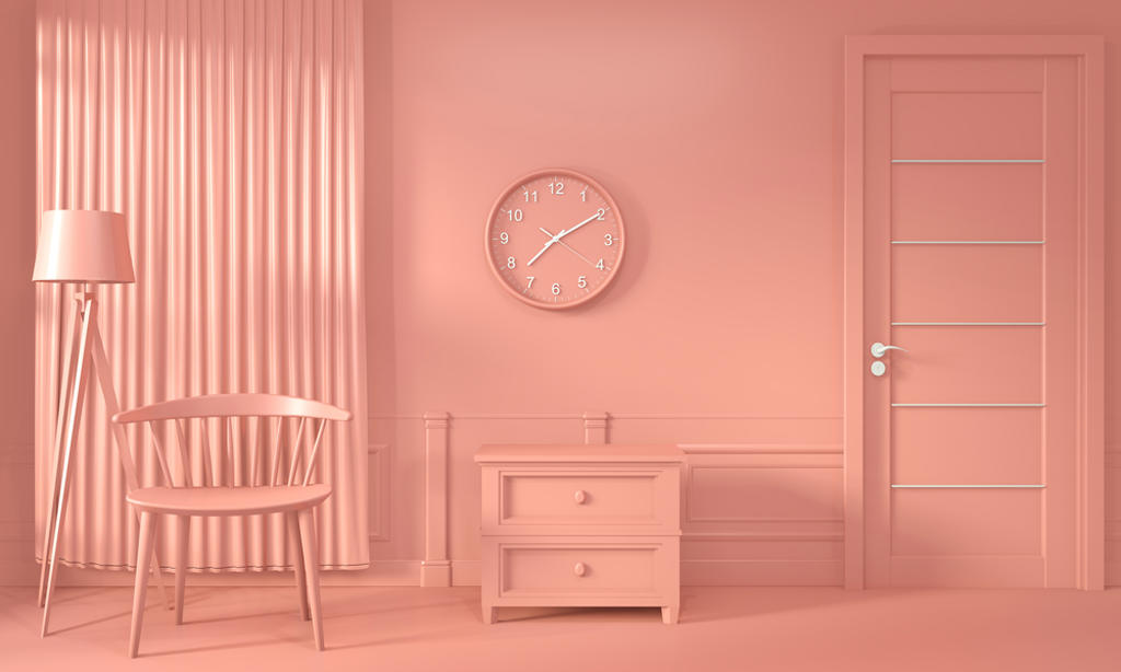
Peach Fuzz Is the Color of the Year: Here’s Why You Should Care
- Why is PMS really a good thing?
- Who decides the “Color of the Year?”
- What artist had a huge hit in 1986 with the song “True Colors?”
As it has done for the past 25 years, the Pantone Color Institute has released its annual “2024 Color of the Year.” Following the quarter-century tradition, this color was given a memorable moniker that represents its look and feel: “Peach Fuzz” (PANTONE 13-1023). Predictably, industries that rely on color for their existence took a deep breath, knowing that all was right in the world!
Of course, the history of this annual announcement is, at the very least, colorful, but there is much more involved in the business of hues than just an annual homage.
What This Means for You — The role of color for consumer products brands and interior design firms cannot be overemphasized. Plus, the creatives, graphic designers, and others who craft marketing campaigns to sell these products spend an enormous amount of time and energy working on the campaign’s color calculus. Why? Neuroscientific research has shown the impact – both positive and negative – of color. If you know the difference between cyan and magenta, you might enjoy this colorful tale.
*****
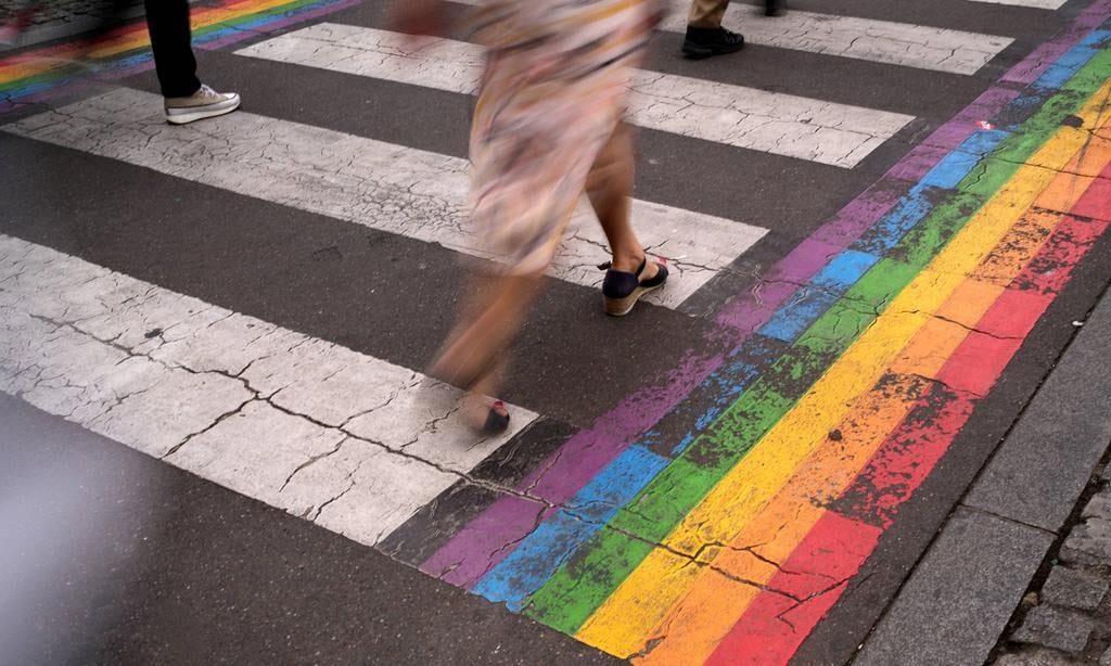
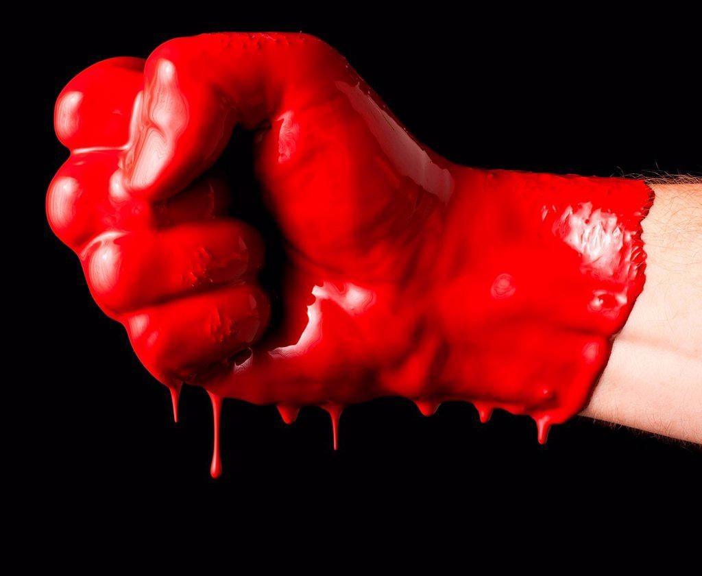
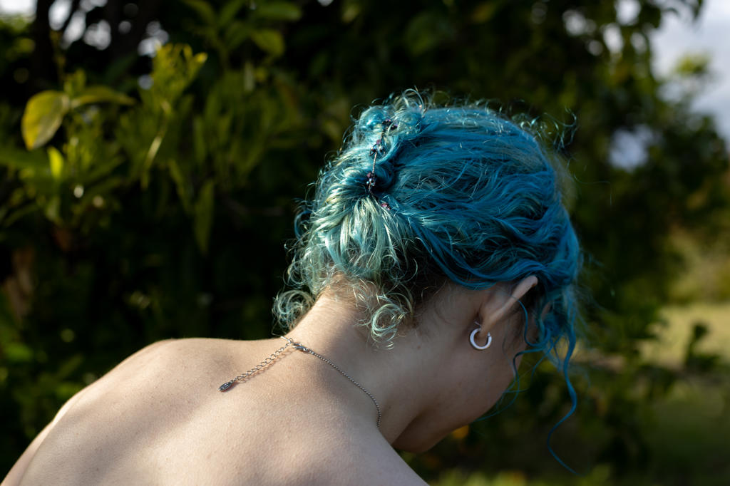
It’s time to ignite your imagination and get inspired by color. Explore vibrant stories painted in bold combinations, bask in the serene elegance of monochromatic moods, and witness the harmonious dance of the entire spectrum – Click here to celebrate color in all its glory.


*****
A Brief History of Pantone
The company behind the “Color of the Year” is Pantone. Several sources note that the company began in New Jersey in the 1950s, as the commercial printing company of brothers Mervin and Jesse Levine, “M & J Levine Advertising.” In 1956, these two ad entrepreneurs made a very good personnel decision.
They hired a young man named Lawrence Herbert as a part-time employee. Herbert majored in chemistry in college, and he used this knowledge to systematize and simplify the company’s stock of pigments and production of colored inks. A few years into his gig, in 1962, Herbert was running the ink and printing division at a profit, while the commercial-display division was (US) $50,000 in debt. He subsequently purchased the company’s technological assets from the Levine Brothers for the amount of this debt (equivalent to $480,000 in 2022) and renamed them “Pantone.”
The rest is…well, you know what the rest is.
Pantone became a color licensing juggernaut. The company developed the Pantone Matching System (PMS), the idea of which is to allow designers to “color match” specific colors when a design enters production stage, regardless of the equipment used to produce the color. This was a game-changer, and the world took notice.
Its “Pantone Guides,” which the company recommends should be purchased each year because the colors fade over time and new ones are added each year, have become the standard for graphic designers throughout the world. Tens of millions of these have been sold.
Pantone also has licensing deals with a wide range of companies from paint to software.
How the Color of the Year Is Decided
If there is any person who is qualified to explain the process of deciding the “Color of the Year” it’s Laurie Pressman, the Vice President of the Pantone Color Institute. In an interview published to announce this annual pinnacle of pigment, she explained how The Color of the Year is decided.
“The Pantone Color Institute originally created the Pantone Color of the Year educational program in 1999 to engage the design community and color enthusiasts around the world in a conversation around color,” she said. “We wanted to draw attention to the relationship between culture and color — to highlight to our audience how what is taking place in our global culture is expressed and reflected through the language of color.
“Through the years the Pantone Color of the Year program has become a globally iconic cultural touchstone, capturing the imagination of so many designers, brands, and consumers. As we celebrate the 25th year of our program and the fundamental role color plays in our shared human experience, it is our hope that we have inspired you to look at color in a different way — that color and its connection to emotion and the expression of human feelings will take on a new significance.
“Since we introduced “Cerulean Blue” as the first Color of the Year in 1999, we have seen this program influence product development and purchasing decisions in nearly every industry and country around the world. Growing in popularity each year, its impact is felt across fashion, color cosmetics, home furnishings, automotive and industrial design, as well as product, packaging, multimedia design, and commercial interiors.”
This selection process is more herculean than one might imagine. First off, the decision is the result of a type of global treasure hunt. Pressman notes that the team of global color experts at the Institute comb the world looking for new color influences. She says this can include the entertainment industry and films in production, traveling art collections and new artists, fashion, all areas of design, aspirational travel destinations, new lifestyles, playstyles, or enjoyable escapes, as well as socio-economic conditions.
Influences may also stem from new technologies, materials, textures, and effects that impact color, relevant social media platforms, and even upcoming sporting events that capture worldwide attention.
Pressman adds, “There’s also a misconception that we gather a bunch of color influencers in a room one day and emerge with the decision. As many of our Pantone Color Institute team members own their own design studios, contribute to key influential global trend forecasts, work with clients prescribing color choices for brand or product visual identity, and even teach classes on color, their daily conversations are rooted in color and design, including material and surface finish.
“As a result, conversations relating to the Pantone Color of the Year selection do not take place in one isolated meeting at a specific time of year. It is one long, continuously flowing conversation among a group of color-attuned people. The commonality that brings them together is their expertise in color and design, and their ability to see the world through the lens of color. That’s why I liken them to being color anthropologists.”
Practical Applications for the Color of the Year
The philosophical aspects of color and how it relates to culture are fascinating, but what about the “rubber” and where “it meets the road?” What does Peach Fuzz or any other Color of the Year mean to the day-to-day design business?
The graphic design website Visme notes, “The extensive color trending research done by the Pantone Color Institute saves you countless hours of marketing research for your own business. When the new color is announced in December, you or your designers should investigate how it can be incorporated into your business.”
This is similar to the time and money creative teams can save using the SuperStock research of stock and video images.
The site suggests other ways designers and brands can take advantage of the Color of the Year.
- Clothing companies can design garments in Peach Fuzz color.
- Interior designers can use the color for drapes, interior paint, upholstery and accent walls.
- Makeup companies can create a collection based on this color. (What could be better than Peach Fuzz Blush? Nothing, that’s what!)
- Cake and dessert businesses can create Peach Fuzz delicacies. (Peach Fuzz frosting, anyone?)
- Graphic designers that sell ready-to-use designs can create templates or social media graphics using this color.
- Graphic designers can match color stock images from companies such as SuperStock with the Color of the Year as a background or border.
- For a faster solution, you can also easily use the Pantone Color Finder. Insert any PMS number in the search box and it will show you the corresponding RGB and HEX codes to use on the web.
- Advanced editors like Photoshop will take the RGB value.
- Merchandising and promotional products companies can offer Peach Fuzz products.
Men Are from Mars – They Really Like Red
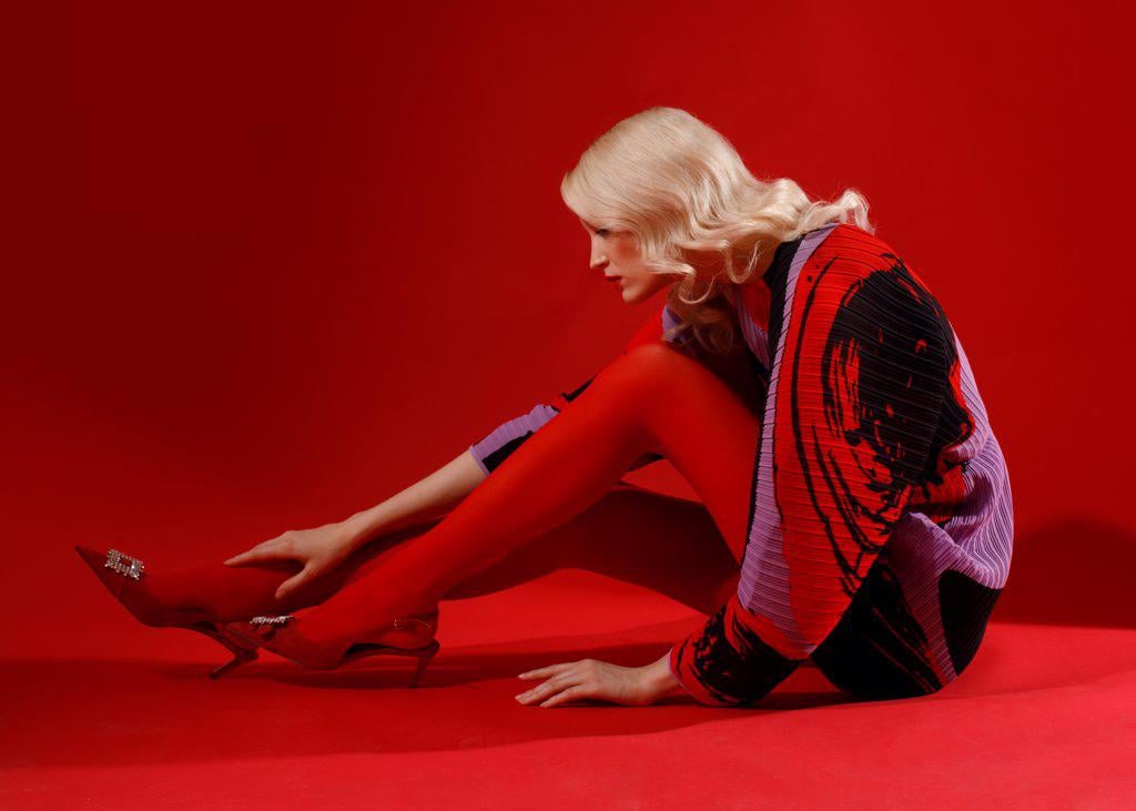
According to color researcher Joe Hallock, “Data showcases some clear preferences in certain colors across gender. Additional research on color perception and color preference shows that when it comes to shades, tints, and hues, men generally prefer bold colors while women prefer softer colors.” This would suggest that women would favor the Peach Fuzz color in graphic design, interior design and products and men would be less likely to dig the Fuzz.
Click here for a deeper dive in the preferences of colors based on gender.
The Hue and Cry of Color

Just how important is color? One way to determine the importance of a subject is to see how many times it appears when the search engine algorithms take over.
Anthropologists have long held that songs – the lyrics and melodies – were one of the ways knowledge was shared and they were partially responsible for the evolution of civilization. When this “song theory” is combined with the massive computational capacity of a search engine such as Google, the hue and cry of color is loud and clear.
Recently, when the phrase “song titles that contain a color” was entered into the search bar, 43,700,000 results popped up. This could be Dylan’s “Tangled Up in Blue,” or Dolly’s “Coat of Many Colors” or maybe the best example of this phenomenon, Cyndi Lauper’s brilliant “True Colors.”
This kitchen-table research is far from scientific, but it suggests how colors have and will continue to drive culture. We’ll have to wait to see how PANTONE 13-1023 changes the world.
*****
*****

Some of the most colorful and stunning photographs and videos ever produced are found in the vast archives of SuperStock. If you need images to show off your true colors, our research is free, so hit us up.