Why Less is More.
There has been a drive towards a cleaner, calmer treatment in visuals recently, particularly in online marketing. This is partly driven by the need to ‘cut through’ in mobile advertising, where small areas of relatively clear, open space really stand out from the rest of the visual noise, allowing marketers messages to be read more clearly on smaller screens.
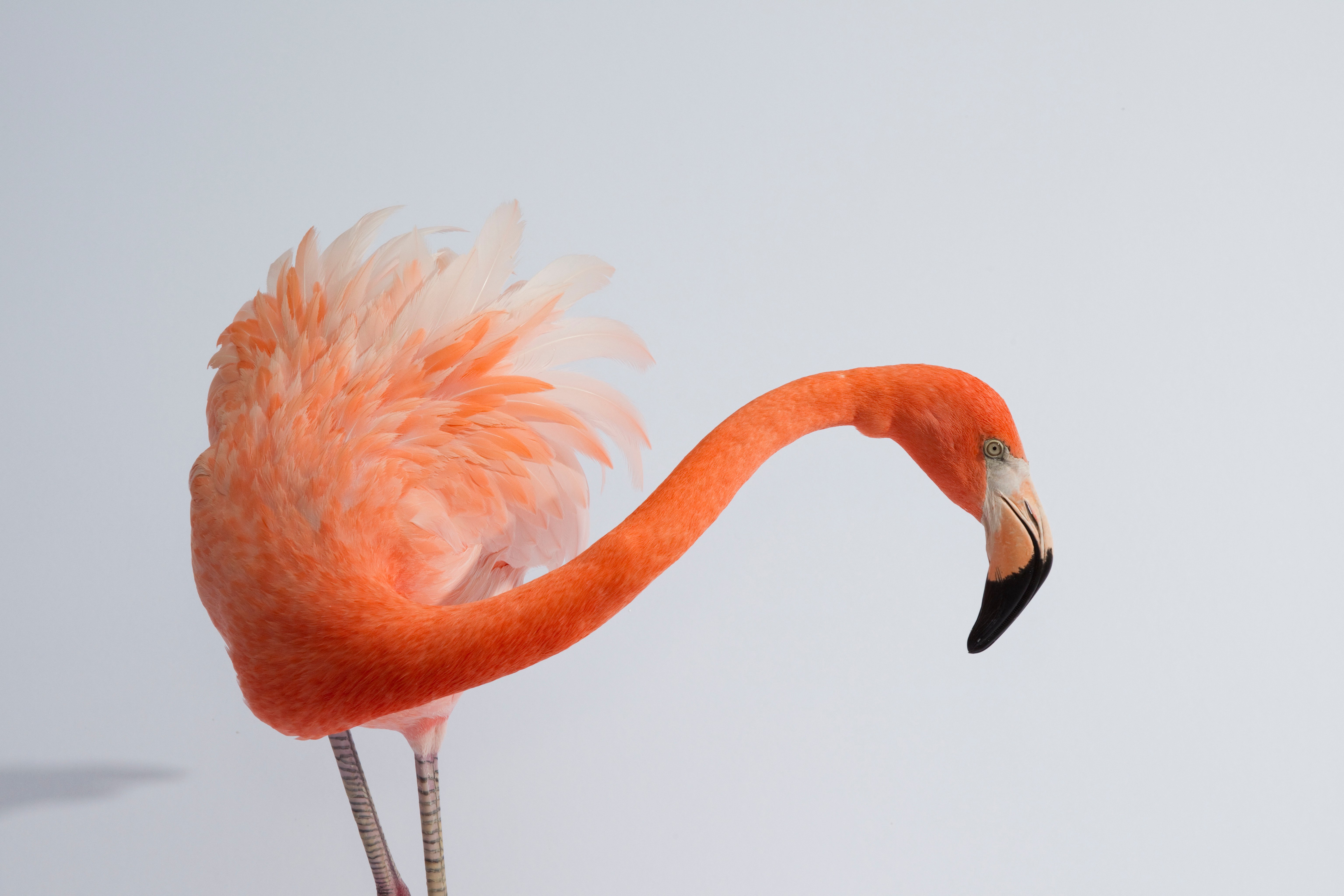 Image Number: 4201-22077672
It makes sense really, because as we scroll through our smart phones each day, refreshing social media, browsing the internet and checking our e-mails, the brands using this cleaner aesthetic to allow their message to breathe and be noticed are likely to be more successful in engaging us.
As a rule, the acid test for any successful ad is to be uncluttered, impactful and able to clearly communicate a benefit to the consumer. It’s astonishing these days, however that so few pieces of marketing achieve even one of these three pre-requisites.
 Image Number: 1773R-15265009
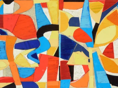
Abram Games, one of thegreatest poster designers of the 20thcentury was a master of sophisticated simplification and using space to allow his designs to breathe.
His work is recognised for its striking use of colour and strong graphic ideas and he made it a rule in his overall approach that his designs should work at a small size, as well as large, because he believed that if poster designs “don’t work an inch high, they will never work.”
Abram Games’ observation ties in well with the ‘thumbnail’ test. The images that tend to stand out when you scroll through a page of potential picture library images to buy are the cleanest, clearest ones rather than the busy, cluttered ones. The thumbnail images you view are not much more than an inch high, so Abram Games’ rule rings true that if the images stand out when small, they’ll certainly stand out when large. But with the huge increase in digital marketing, it’s a necessity that imagery has to work at a small size, competing on a screen in a challenging on-line environment.
The rise of the drone has also had a huge impact on the look and feel of this clean, spare kind of imagery. The ease with which photographers and film makers can now fly drones has resulted in dramatic new perspectives shot from above, that certainly tick the box for simple, graphic compositions that include large areas of copy space and block-like color palettes.
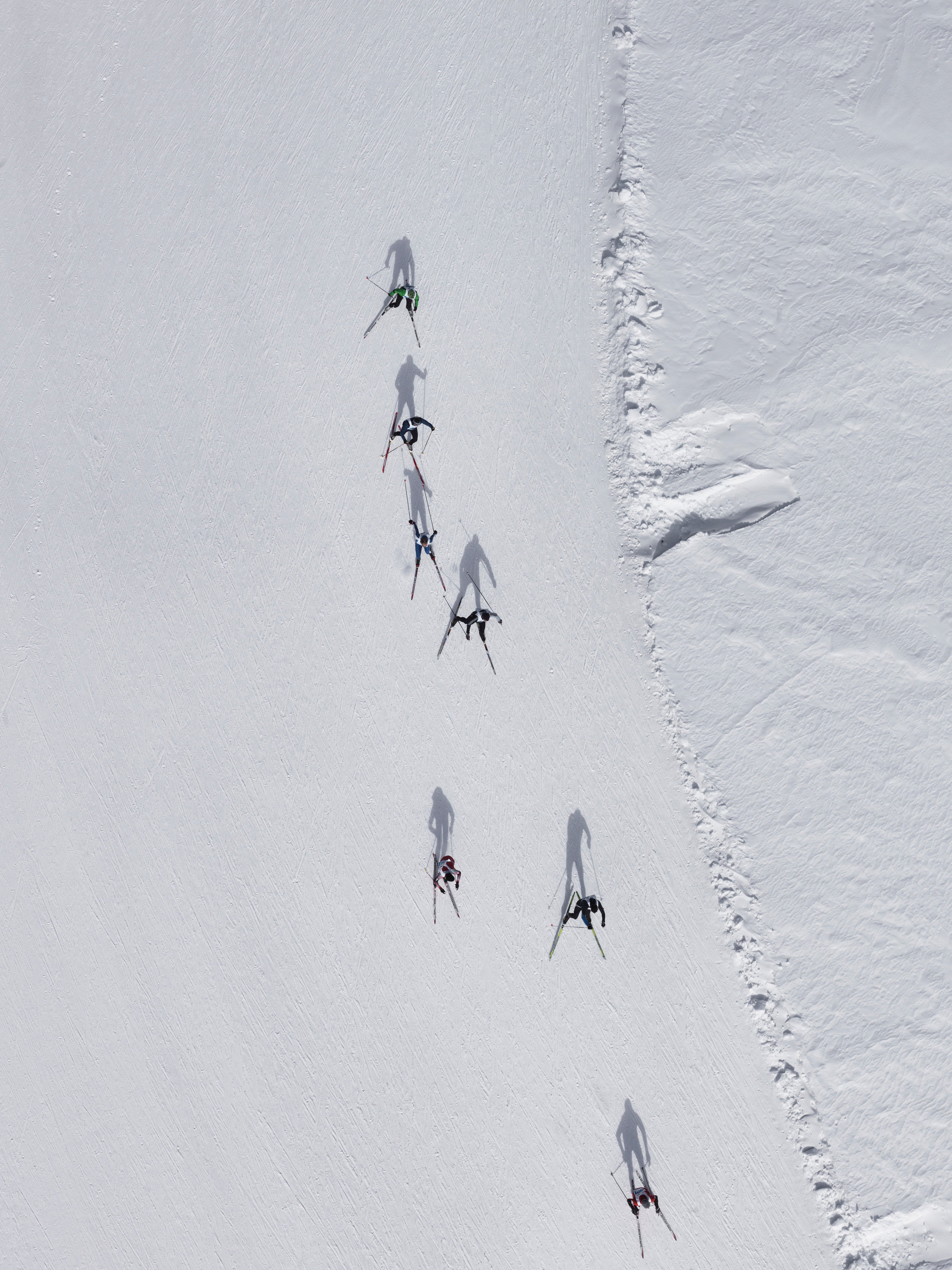 Image Number: 1570R-22118894
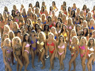
Despite the appeal of this ‘less is more’ aesthetic, it doesn’t herald the end of authenticity in visual communication, marketing, stills and motion. Authenticity still has a valuable role to play in creating credibility, trust and transparency for brands in consumers’ eyes. Lifestyle brands in particular use ‘slice of life’ visuals that connect emotionally with consumers, playing back to them little moments that they themselves have experienced and immediately recognize.
These authentic moments connect with consumers because there is spontaneity in their depictions of real life, showing real people, doing real things. Authenticity has also thrived through the aesthetics of social media – using the visual approach of the average person who takes pictures of themselves and their surroundings. These are then utilized through big marketing campaigns, feeding that aesthetic back to the consumer – with a marketing message attached. It works.
The cleaner, graphic approach I am referring to as ‘less is more’ imagery acts in contrast or possibly as a reaction to authenticity, offering an altogether calmer visual experience for consumers, complete with copy space.
 Image Number: 4450R-22027407
This copy space (or negative space as it is sometimes called) refers to the area which surrounds the main subject in a photograph (the main subject being known as the positive space). As well as adding graphic impact, the negative space is useful for designers and typographers to work with, because it lets the elements breathe so they can design around them.
Copy space is called just that because it can enhance headlines and text. As with imagery, there is also a negative space with typography. It exists between each line of text and typographers call it ‘leading’. Leading makes type much more legible by allowing it to breathe. Again, using Abram Games’ inch high test – if an image is composed well, with enough space around the subject for clarity and for text to communicate a message strongly, you have an impactful marketing piece.
 Image number: 1795R-18583
In applying this aesthetic discipline, the main subject of a photo is emphasised, drawing your eyes to it. The negative space can then give your eyes somewhere to rest, to then read the message clearly, resulting in a very successful composition.
You could liken it to the silence in music, in between the notes. The silence is important, because without it the notes would not have meaning. So it follows that the subject in an image relies on the negative space around it to mean something, and can actually mean more because if its relationship to the amount and composition of that space.
 Image Number: 1525R-11473558
Although he doesn’t use type, someone who uses negative space really well is the award winning graphic artist Noma Bar. https://www.dutchuncle.co.uk/noma-bar-selected-images
He has gained a following throughout the world, with his witty, creative and perceptive designs where he uses space as importantly as he uses form.
He is known for his ability to see things differently as well as his use of negative space to create images that make the viewer do a double take. He uses colors very boldly and his use of an economy of shapes and iconography makes his style immediately recognisable.
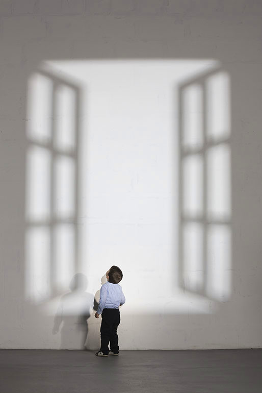 Image Number: 1570R-20441285
Noma Bar’s work has been described as deceptively simple, featuring flat colors, minimal detail and negative space. His genius is to create images, often carrying double meanings that only become apparent a second or so after first viewing his them. Similar in impact to a comedian’s gag, there’s a small beat before the punch line connects with the audience and they are rewarded with a laugh.
Bar says that his approach is all about stripping out unnecessary detail or decoration that he feels would detract from an image’s message. Instead, he aims for ‘maximum communication with minimal elements’.
Which brings us neatly back to the aesthetics behind the images in the link below; less is more.
View Our Full Gallery Below